
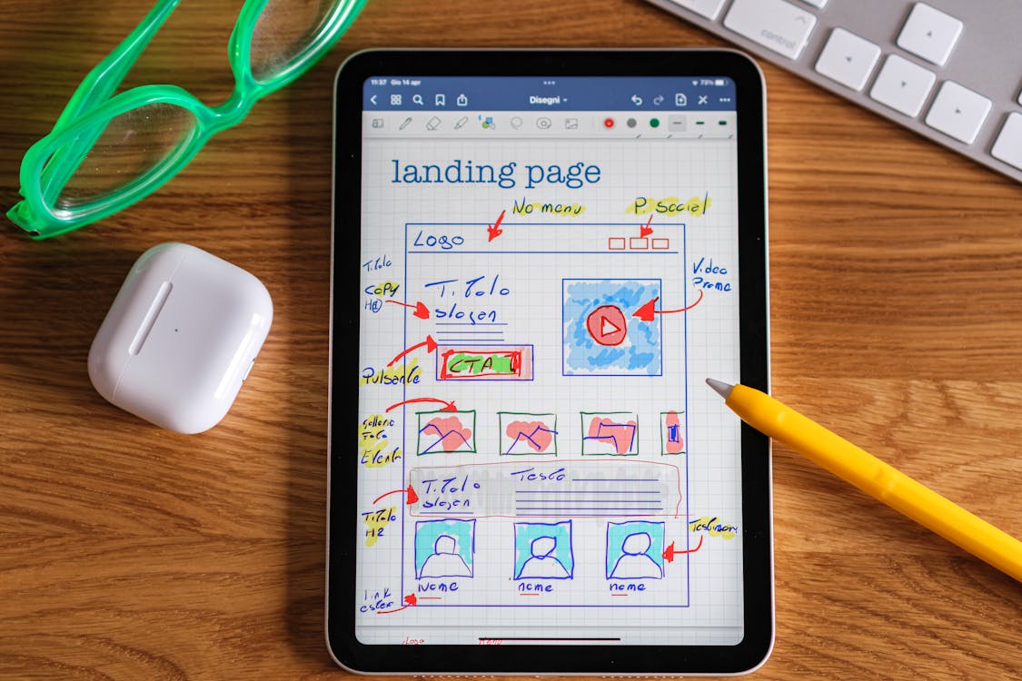
Creating a landing page can be difficult, as well as starting with a website, how do you keep users engaged when they first enter your site? A landing page is where someone first takes eyes on your website, and decides whether they're still interested in scrolling or navigating around to learn more. This page is important as it's the first thing that captures new users from continuing your site.
What makes a landing page great?
There are plenty of ways that a landing page can be engaging for users. It's best practice to start off understanding who your target audience is, who are you truly trying to acquire? You can't please everyone, so your landing page doesn't have to be perfect, but it needs to be effective for the right users you're trying to convert. A high conversion page must consist of these elements: • Choosing the right colors and fonts • Mobile Friendly (Responsive) • Text that impacts your audience • Clear Call to Action
Choosing the right colors and fonts
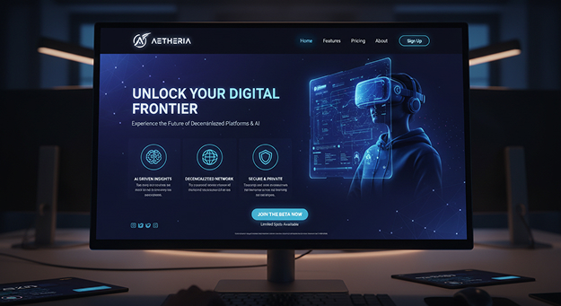
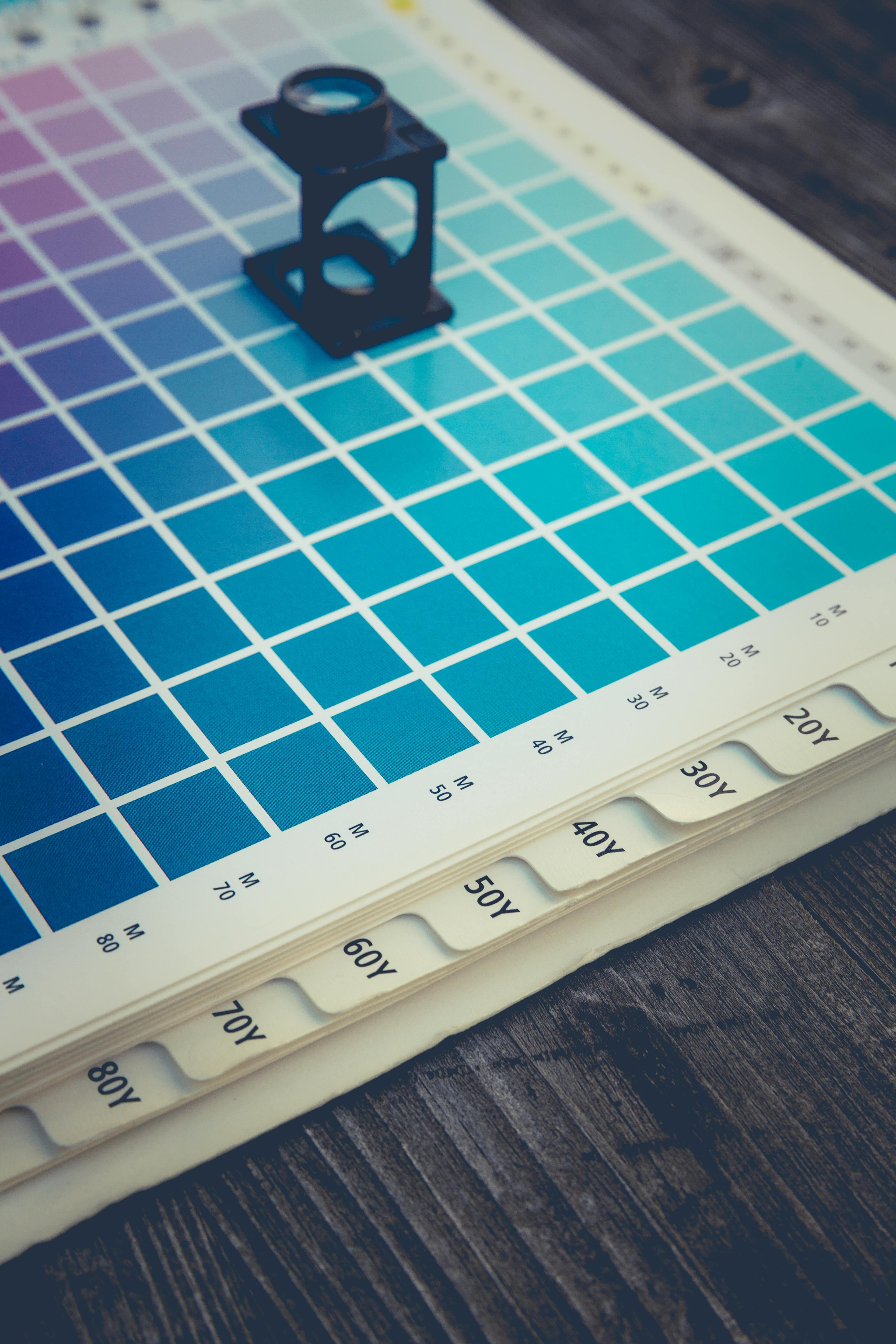
When creating a landing page, it's best to utilize the right colors and fonts that will spark attention to your users when seeking out your services/products. A high-conversion landing page isn't just about layout and copy—it's about guiding the user's eye with intentional color choices. By leveraging analogous, complementary, and tertiary color relationships, you create a visual hierarchy that feels natural, engaging, and persuasive.
Analogous Color
Analogous colors—three colors sitting next to each other on the color wheel—create a smooth, cohesive visual experience. They're ideal for the foundational elements of your landing page. How to apply them: • Use darker analogous shades for primary headings and key callouts — This creates strong visual anchors and helps users instantly understand what matters most. • Use lighter analogous shades for supporting text, subheadings, and secondary links — These tones keep the page readable and balanced without competing for attention. • Apply mid-tones for backgrounds or section dividers — This creates natural flow between sections while maintaining a unified look.
Complementary Colors
Complementary colors sit opposite each other on the color wheel. They create instant contrast and are perfect for drawing attention to conversion-driving elements. How to apply them: • Use complementary colors for your primary CTA buttons — This ensures your "Sign Up," "Buy Now," or "Get Started" buttons stand out immediately. • Use complementary accents to highlight testimonials, badges, or limited-time offers — These pops of contrast guide the user's eye toward trust-building elements. • Use complementary color pairs sparingly — Too much contrast becomes overwhelming; use it only where you want action.
Tertiary Colors
Tertiary colors are created by mixing a primary color with an adjacent secondary color (e.g., red-orange, yellow-green, blue-green). They're excellent for adding nuance and depth. How to apply them: • Use tertiary colors to create smooth transitions between sections — This prevents harsh breaks and keeps the user scrolling. • Use tertiary tones for icons, illustrations, or subtle UI elements — They add personality without overpowering the main palette. • Use tertiary colors to soften complementary contrasts — This helps maintain harmony while still emphasizing key elements.
Font Selection
When choosing fonts, it's best practice to select fonts that are easy to read and accessible to everyone. Most landing pages consist of a main heading that is either a sentence or a callout representing who they are as a business, a subheading to support their heading claim, and sometimes a small description that describes their business. Remember that choosing fonts requires the Golden Rule: when selecting sizes for your landing page's title, subtitle, or description, the larger heading should be at least *1.618 times* the size of the smaller heading to emphasize the main title. For example, if your subheading font size is 18px, your main heading should be 29px to showcase the difference between the two fonts. When choosing font styles, my approach has always been to choose whatever represents your company, as long as you have a font style that is fully readable, with clear weight variations to emphasize bold and italic styles easily. Depending on your brand, choose a simple font for descriptions such as DM Serif Text, Montserrat, Sans Serif, Arvo, or anything that doesn't include Helvetica, as this widely-used font may not help your brand stand out.
Mobile Friendly (Responsive)
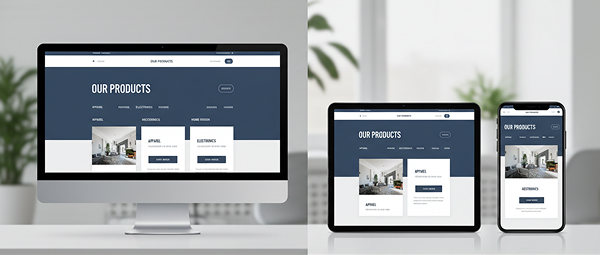
Creating a mobile-friendly landing page is highly crucial, as this is extremely important when users check out your business. Based on a report from SalesCycle ("ECommerce Stats & Trends Report," 2023), desktop users usually account for 21% of web traffic while mobile users represent 71%, which is 50% more traffic on mobile layouts than desktop layouts. While mobile conversion rates are 71% compared to desktop users at 29%, this shows the importance of having a mobile-friendly landing page that's just as effective as having an effective desktop landing page.
What Makes a Responsive Design?
A responsive design means that no matter the width of the dimension, your website needs to respond nicely to any width to ensure that any new phones, tablets, or computers of different sizes will look professional on all devices. Any cutoffs, mistakes, or ugly inconsistent layouts on your site can drive away potential users when looking at your site. To create a responsive landing page means giving the same attractive experience when capturing new users and achieving higher conversion rates.
Text That Impacts Your Audience
Writing the right headings, subheadings, and descriptions can truly make a difference when new users want to decide whether to continue looking at your site. Before starting on writing a heading for your landing page, describe what your value proposition is first before jumping the gun. A value proposition should be clear and identifiable. Figure out what product or service you are offering, then in one sentence, explain why this is important to your target audience. The purpose of a value proposition is to communicate what makes your business important in one sentence. Without it, users will bounce off your site before they can get into the details. Ensure that you communicate that at the top corners or center of your landing page to hook your audience.
Clear Call to Action
What's most important in a landing page is including a call to action, making it easier for new users to convert. A call to action is what you want your users to do on your site, whether that be filling out a contact form, clicking a button to call, or accomplishing the purpose of what your website is trying to achieve. Your call to action should be clear, concise, and easy to find on the landing page when users first enter your site. Make it as simple and effective as possible for any new users to interact with and engage on your site. If your call to action is difficult to find or navigate to, this could lose the attention of your users and cause them to bounce off the site. Ensure you hook and reel users with an engaging header and a simple but effective call to action button, such as "Book an Appointment Now," "Download a Demo," or "Order Now."
Key Takeaways
A great landing page isn't about having the most features or the flashiest design—it's about focus, clarity, and intent. From the moment a user arrives, every element should work together to communicate value, guide attention, and encourage action. Thoughtful color choices, readable typography, responsive design, and impactful messaging all play a role in keeping users engaged. When you understand your target audience and design specifically for them, your landing page becomes more than just an entry point—it becomes a conversion tool. By pairing a clear value proposition with a simple, easy-to-find call to action, you create an experience that feels intuitive, trustworthy, and effective. In the end, a high-converting landing page doesn't try to do everything—it does the right things well.
Sources & References
Found this article helpful? Share it with your network!